
Child Growth Tracking
Contains adsIn-app purchases
3.4star
1.13K reviews
100K+
Downloads

Everyone
info


About this app
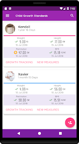
Infant Growth Patterns is one of the most comprehensive applications for growth tracking among boys and girls ages 0-19 based on international percentiles of the World Health Organization.
****** (Not applicable for premature babies) ******
Growth is not only a result of nutrition but inherited factors. Ethnicity can influence a child's growth patterns, so some countries have their own Growth Pattern Curves. However, the World Health Organization (WHO) Growth Pattern Curves are the most frequently used and considered the global standard.
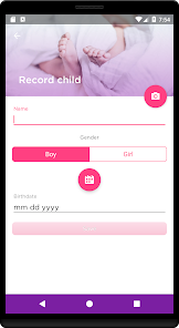
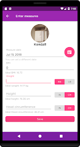
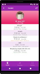
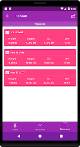
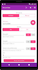
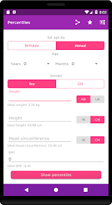
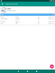
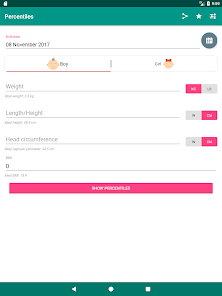
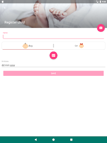
This application will allow you to add one or more children and easily control their height, weight, head circumference, body mass index and weight ratio for height.
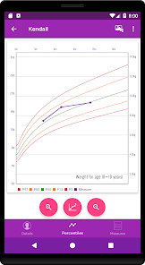
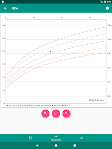
In addition, with graphs of percentile curves you can detect trends in their development to anticipate possible problems in their growth.
The charts used in this application are based on the standards proposed by the WHO (World Health Organization).
****** (Not applicable for premature babies) ******
Growth is not only a result of nutrition but inherited factors. Ethnicity can influence a child's growth patterns, so some countries have their own Growth Pattern Curves. However, the World Health Organization (WHO) Growth Pattern Curves are the most frequently used and considered the global standard.
This application will allow you to add one or more children and easily control their height, weight, head circumference, body mass index and weight ratio for height.
In addition, with graphs of percentile curves you can detect trends in their development to anticipate possible problems in their growth.
The charts used in this application are based on the standards proposed by the WHO (World Health Organization).
Updated on
Safety starts with understanding how developers collect and share your data. Data privacy and security practices may vary based on your use, region, and age. The developer provided this information and may update it over time.

No data shared with third parties
Learn more about how developers declare sharing

This app may collect these data types
Location, App info and performance, and Device or other IDs

Data is encrypted in transit

Data can’t be deleted
Ratings and reviews
3.4
1.12K reviews

A Google user
- Flag inappropriate
January 26, 2019
The % chart is clear and easy to read, the best of many apps I've tried. Entering data is harder than it needs to be, having to flip through dates instead of pick on calendar. being able to see the line I'm entering data on would be nice. The height line, for example, is covered by my keyboard. Easy to use, but others are easier/faster.
4 people found this review helpful
A Google user
- Flag inappropriate
December 27, 2019
The developers of this app don't seem to understand what percentiles mean. Labeling the WHO 50th percentile value as "ideal" is both medically inaccurate and unnecessarily concerning to parents. At best, you could label a range as "typical" (e.g. 5th to 95th percentile). The app also flags any measurements outside of 15/85% as abnormal, which isn't right by itself and isn't even consistent with the WHO recommended cutoffs (2/98%). Also some weird English translations (perimeter vs. circumference) and it's awkward to use with inches/pounds (when you go to edit a measurement the value is in kg/cm even if you entered it in lbs/in).
2 people found this review helpful
EDXR
December 27, 2019
Thank you for the constructive review, I will take your comments into account, we are here to improve greetings.
A Google user
- Flag inappropriate
May 6, 2019
fast and easy .
4 people found this review helpful
What's new
** 2.4.0
- Updating of libraries
- Bug fixes
- Search option
- Updating of libraries
- Bug fixes
- Search option


